
Do you want to add an attractive and functional Radar Chart Widget to your WordPress website using Elementor? But don’t know the process of using it? Don’t worry! We are here to help you.
In this article, we will teach you Step by step process of using the Bar Chart widget in Elementor.
What is Radar Chart?
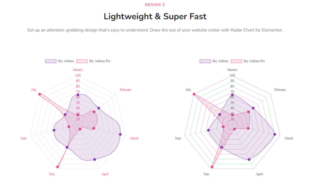
A Radar Chart is a graphical representation of multiple quantitative variables in the form of a two-dimensional chart of three or more quantitative variables represented on axes starting from the same point. It is also known as a “spider chart,” “star chart,” “polar chart,” or “web chart.” It is often used to visualize data and compare multiple data sets.
Why Radar Chart is Important?
Radar Charts are important because they:
- Visualize multi-dimensional data: They allow multiple quantitative variables to be displayed and compared on a single graph.
- Show relative strengths and weaknesses: Radar Charts help to identify patterns, strengths, and weaknesses in data by highlighting relative comparisons between variables.
- Enhance data interpretation: They provide a clear and concise representation of data, making it easier to understand and interpret.
- Facilitate comparison: Radar Charts enable the comparison of multiple data sets, making it easier to identify similarities and differences.
- Support data analysis: They provide a visual representation of data which can aid in identifying trends, patterns, and outliers, making it easier to analyze and make decisions based on the data.
If you want to add a User-Friendly, Easy to Use, and Reliable Radar Chart Widget then the Radar Chart widget of Sky Addons is the best solution for you. It has lots of cool features which will help you to present your data effectively and make it easier for viewers to comprehend.
So first, we are showing you a short summary of using the Radar Chart widget provided by Sky Addons.
To use the Radar Chart Widget in Elementor, you need to follow these steps:
- Install the Sky Addons plugin on your WordPress website.
- Open the Elementor page editor and add a new section.
- Look for the Sky Addons Radar Chart Widget and drag it into the section.
- Add the data you want to display in the chart, including the labels and values. You can use a CSV file or manually input the data.
- Customize the appearance of the chart, including the color scheme, axis labels, and chart title.
- Preview the chart to make sure it displays the data correctly.
- Save and publish the page.
Now let’s jump into learning the detailed process of using the Radar Chart widget.
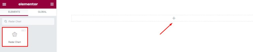
To Insert Widget
Firstly go to your Elementor Editor and find the Radar Chart Widget of Sky Addons from the Widget Panel and then simply drag and drop it into the selected section.
Content
Now click on the Content tab. This tab consists of three sections. They are Radar Chart, Additional, and Animation.
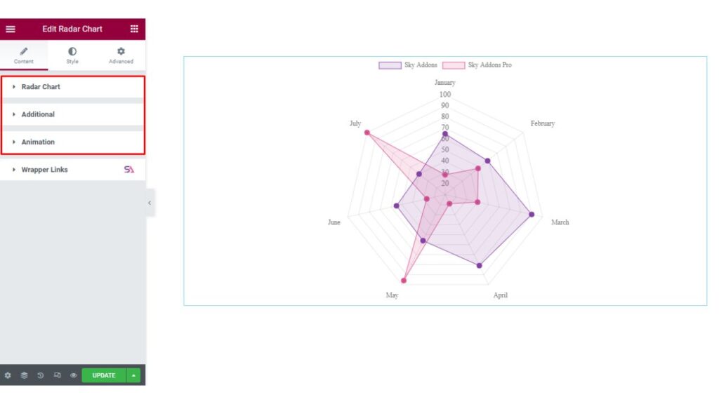
Radar Chart
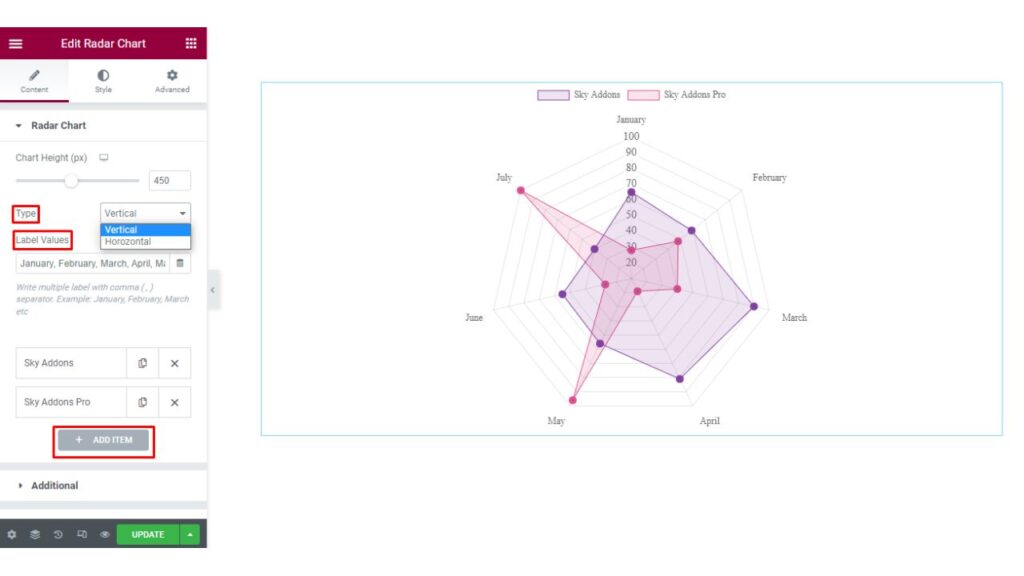
The first section is the Radar Chart section. Here you will be able to change the Chart Height. You can select the Type of Radar Chart. You may select it Vertically or Horizontally according to your choice.
You will find options to add Label Values.
Label values: Label Values in a Chart refer to the values displayed on or near each bar in the chart. These values represent the height or length of the bars and provide a way to compare and visualize data. Labels can be displayed directly on the bars themselves, or next to them, and can be formatted to show specific units of measurement, such as dollars, percent, etc. The use of label values helps to provide context and understanding for the data being displayed in the chart.
Here you can Write multiple labels with a Comma ( , ) Separator. Example: January, February, March, etc.
You can add as many as Items you want to add just by clicking on the Add Item Button.
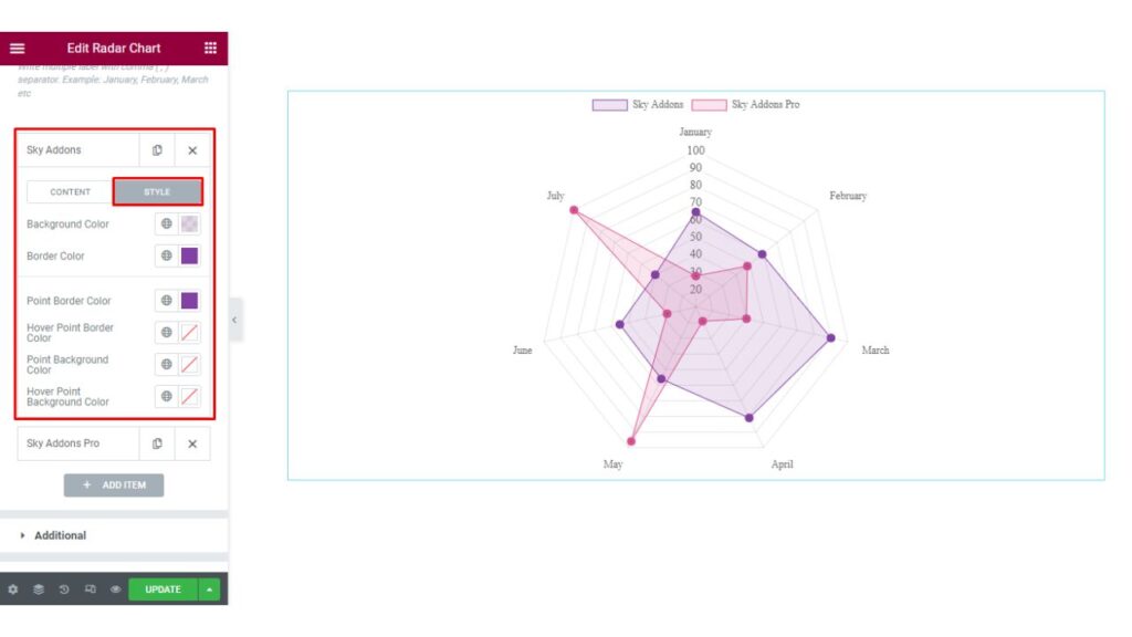
When you will click on any Item, there you will find Content and Style options. The Content option allows you to add the Label Text and Data.
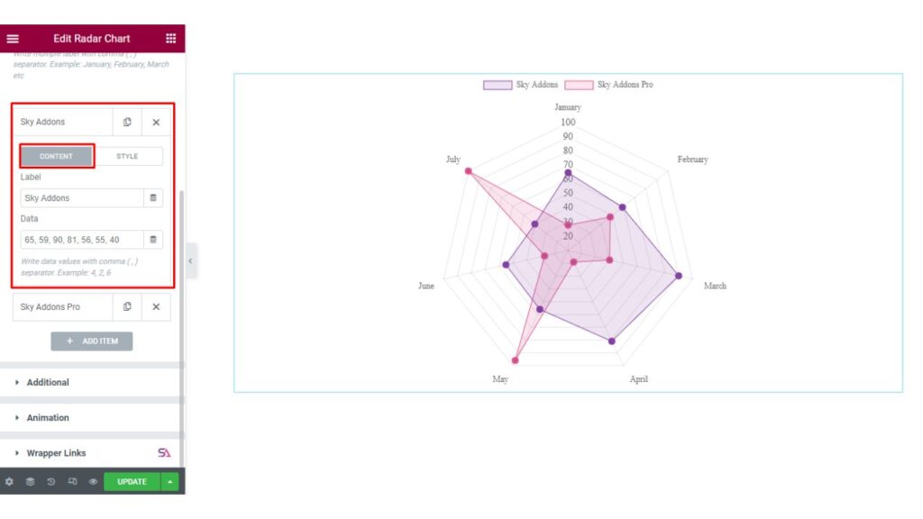
On the other hand, here the Style option allows you to Change the Background Color, Background Hover Color, Border Color, and the Hover Border Color.
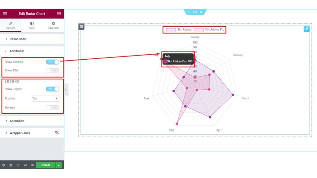
Additional
Now the next section is the Additional section.
From here you can enable/disable the Show Tooltip and Show Title option.
At the bottom of this section, you will find an option named Legend. For those who are not familiar with the term called Legend, we will describe first what is Legend in a Chart.
Legend: A Legend in a chart is a visual element that explains what each color or pattern in the chart represents.
It is typically located outside of the main chart area and maps the elements in the chart (such as bars, lines, or markers) to a corresponding description or label. The legend can be used to distinguish between different data series, variables, or categories in the chart. It helps to provide clarity and context to the chart, making it easier for the viewer to understand and interpret the data.
Here you may enable/disable the Show Legend option and Change the Legend’s position. You can also Reverse the Legend just by enabling the Reverse option.
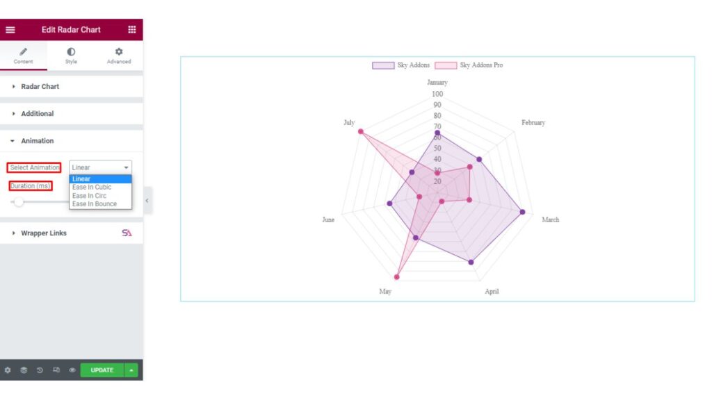
Animation
In the Animation section, you can select the Animation Type. You can choose from Linear, Ease in Cubic, Ease in Cric, and Ease in Bounce options.
You may also adjust the Animation Duration according to your choice.
Style Tab
Now we move to the Style tab. Here you will find all the styling options. This Style tab consists of 5 sections. They are Chart, Legend, Point Labels, Tricks, and Tooltip.
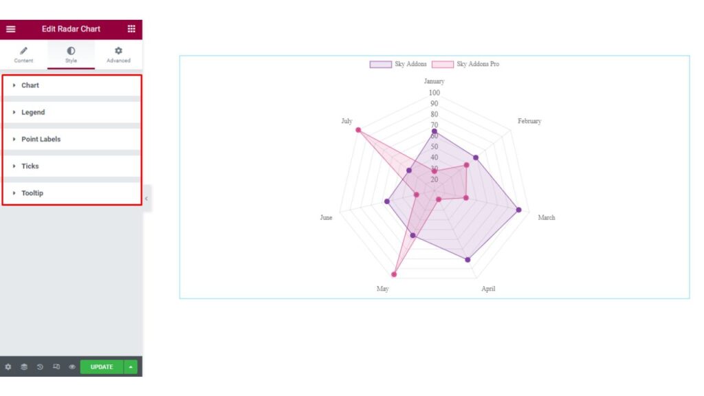
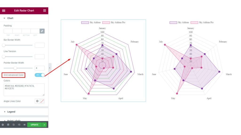
Chart
Firstly in the Chart section, you will be able to adjust the padding, Bar Border Width, Line Tension, and Pointer Border Width of the Radar Chart. If you want you can also enable the Grid Advanced Color option. You are allowed to select the Angle Lines Color.
Line Tension: A line chart is a graphical representation of data that uses lines to connect individual data points. Line Tension is a property of a line chart that determines how the line is drawn between data points. The line tension can be used to control the appearance of a line chart and can be used to create different visual effects.
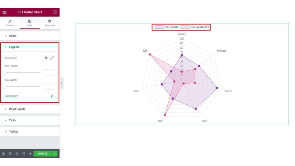
Legend
In the Legend section. Here you are allowed to change the Legend’s Text Color, Box-Height, Bar-Width, etc.
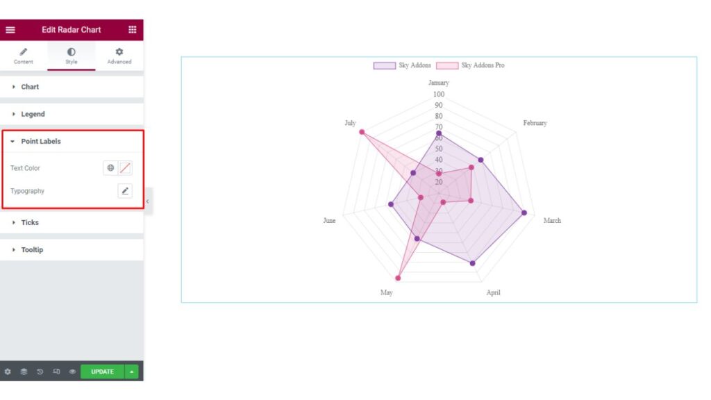
Point Labels
The next section is the Point Labels section. Here you can style your Radar Chart’s Label by changing the Text Color and Typography.
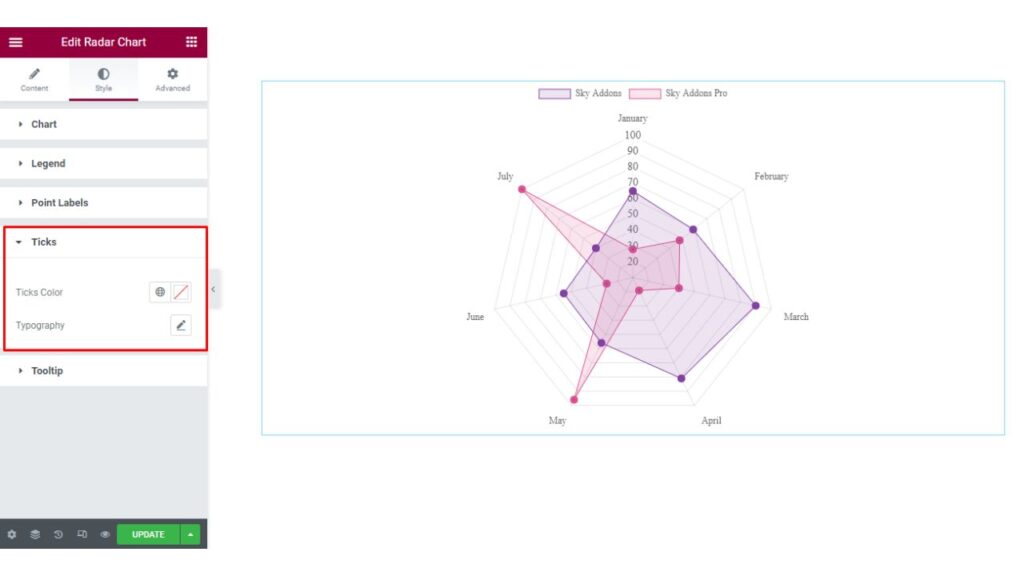
Tricks
In the Tricks section, you can change the Tricks Text Color and Typography.
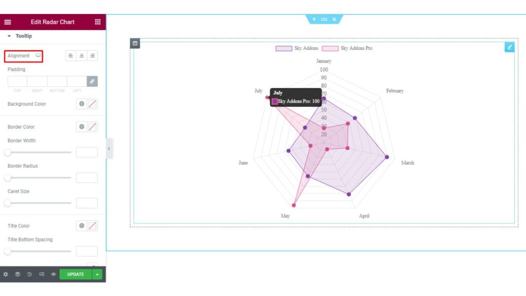
Tooltip
The last section is the Tooltip section. In this section, you may set the Alignment of the Tooltip. You can Style the Tooltip by changing the Color, Typography & other aspects as per your needs.
Finally, we are done with the tutorial. We hope you have understood the process of using the Radar Chart widget of Sky Addons in Elementor.
If you have any questions or queries regarding this please feel free to contact our website – https://wowdevs.com/support/
and don’t forget to visit our demo website – https://demo.skyaddons.com/elementor-radar-chart-widget/